Intoduction
Since 2014, the number of mobile devices has exceeded that of PCs. By the end of 2020, Google will lay out its search engine on "Mobile First-Indexing". With a responsive adaptation of your online shop to tablets and smartphones, you can continue to score on Google and increase business opportunities.
At the moment, epages 6 does not offer any adaptation to tablets, nor does it offer a smartphone version compliant with "Mobile First". With our responsive design service, you can therefore optimize your shop for tablet and smartphone devices Google and user-friendly and also offer your customers all the functions of your shop on the smartphone version.
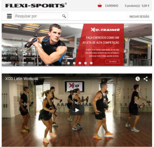
Example for Tablets
Typically when Responsive Design is applied, various screen elements are changed as soon as the online store or the website will be displayed on a screen with the standard tablet resolution.
As shown in this example, the headers height will be reduced, as well as the size of the store logo. The links in the header will be replaced with icons.
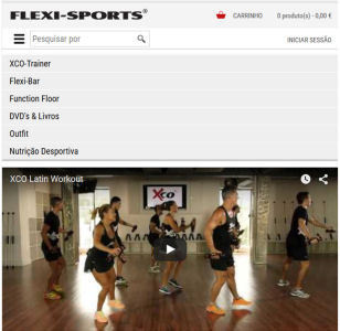
The menu in the navigation bar below the header is replaced with one single button which opens the main menu by pressing it.
Content, including images, are resized to 100 % of the existing screen width .
 |
 |
| Tablet Version |
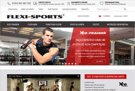
PC Version |
| |
|
 |
 |
| Tablet Version with opened main menu |
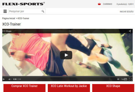
Inner page with responsive desgin |
Examples for Smartphone adaptation of the desktop version [Google Mobile-First Anpassung]
You can find examples of adaptation of the Smartphone version via the desktop version on the following epages 6 shops:
All functions of the Desktop Version (user account, cross selling, etc.) are available on the mobile version!
epages 6 Demo Shop responsive desktop customization for smartphones :: Mobile First
This is how the desktop version of an epages 6 shop works on a smartphone whose theme has been adapted to responsive design:
Your Advantages
Adapting your ePages online shops for Tablet Computer optimizes the presentation and use of shop and website content and functions, and also the number of visitors and revenues.
The adapted tablet version preserves the original design concept of the PC version. So your customers has the same Look & Feel on the tablet version and the brand of your company.
Changes to your ePages online shop
And these changes are made on your ePages shop:
- Resizing of the company logo
- Sizes and adapting content header
- Replace the main menu by a menu button with list of all major categories
- Adjusting the slider on the home page (just Customized Sliders)
- Adapting the text content
- Adapting the category lists
- Adjustment of product lists
- Adjustment of product pages
- Sizes, and content adaptation of the skirting-board
We provide indiviuelle solutions for itens already custimized on the PC version, too.
What benefits have your customers?
- Your Online Store appears completely on Tablets and Smartphones
- The menus are easy to operate
- Texts and contents are legible
- Easy to use all functions
- Your customers will experience a positive experience and like to buy into your shop.
Mobile First and other Advantages for Adapting to Smartphones
With the adaptation of the desktop version to smartphones, you will will get the following advantages for your epages 6 shop:
- The smartphone version of your epages 6 shop gets fit for "Mobile First"
- All content is displayed automatically and as completely as intended on both versions.
- All meta tags are fully adopted on both versions
- The main menu is available on all pages and allows you to open and close submenus
- Category lists are displayed on the smartphone version with pictures
- Cross selling products are suggested to the customer on the product page
- User account and user functions are completely taken over
What is the difference between the "Mobile View" of your epages shop and a responsive adaptation of the desktop version?
The "mobile view" of your epages shop is a separate, "slimmed down" version of the desktop version of your epages shop. But not all content and functions are taken over. When adapting through responsive design, all functions, content and meta tags are retained and visually adapted to the screen size (more precisely the resolution). You can then deactivate the mobile view.
How do I determine if my ePages online shop is adapted to Tablets Devices?
The easiest way is of course to try your epages shop on a tablet device. If possible, use a mini-tablet with an 8-inch screen. If you have no tablet device available, open your ePages online shop in your PC browser and reduce the width of the browser window.
If elements are cut, such as menus and page content, under a certain screen width and if the shop does not fit itself to the changing width of the browser window, you should consider an adjustment to consider and make use of our service offering.
What else can you apply for?
If you have created content on your shop that does not allow an appropriate display behavior, such as wide tables, we are happy to adjust this content on request. You will receive an estimate in advance.
IMPORTANT INFORMATION
Viamodul reserves the right to examine the existing design concept for necessary changes to adapt to a responsive version before accepting an order and, if necessary, to present a proposal for this. The implementation corresponds to the currently applicable and known guidelines from Google, which are available on the desktop version of epages 6.


